About
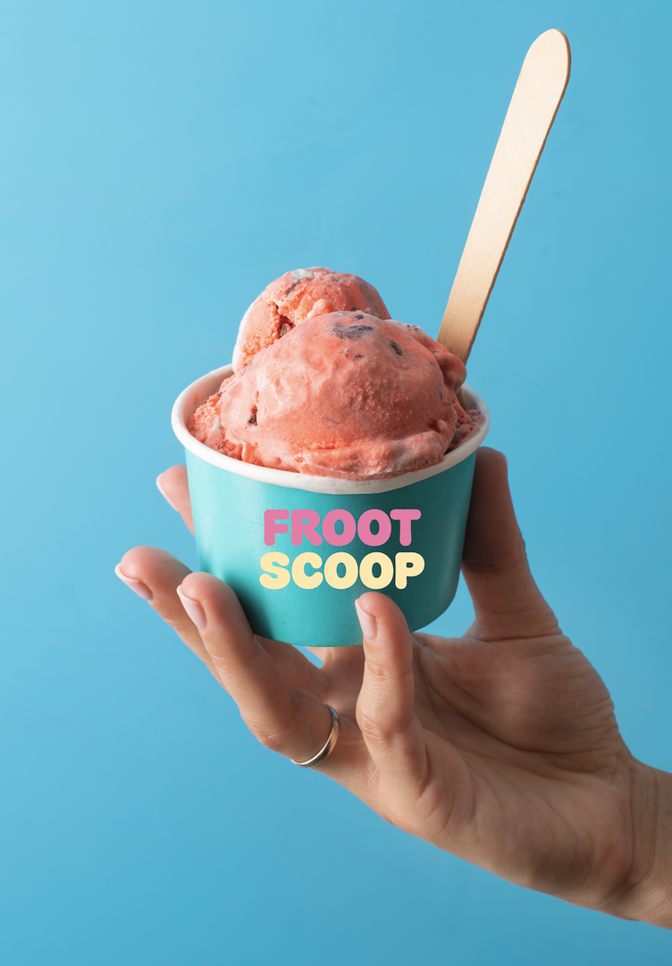
“Froot Scoop” is all about ice cream that follows the seasons.
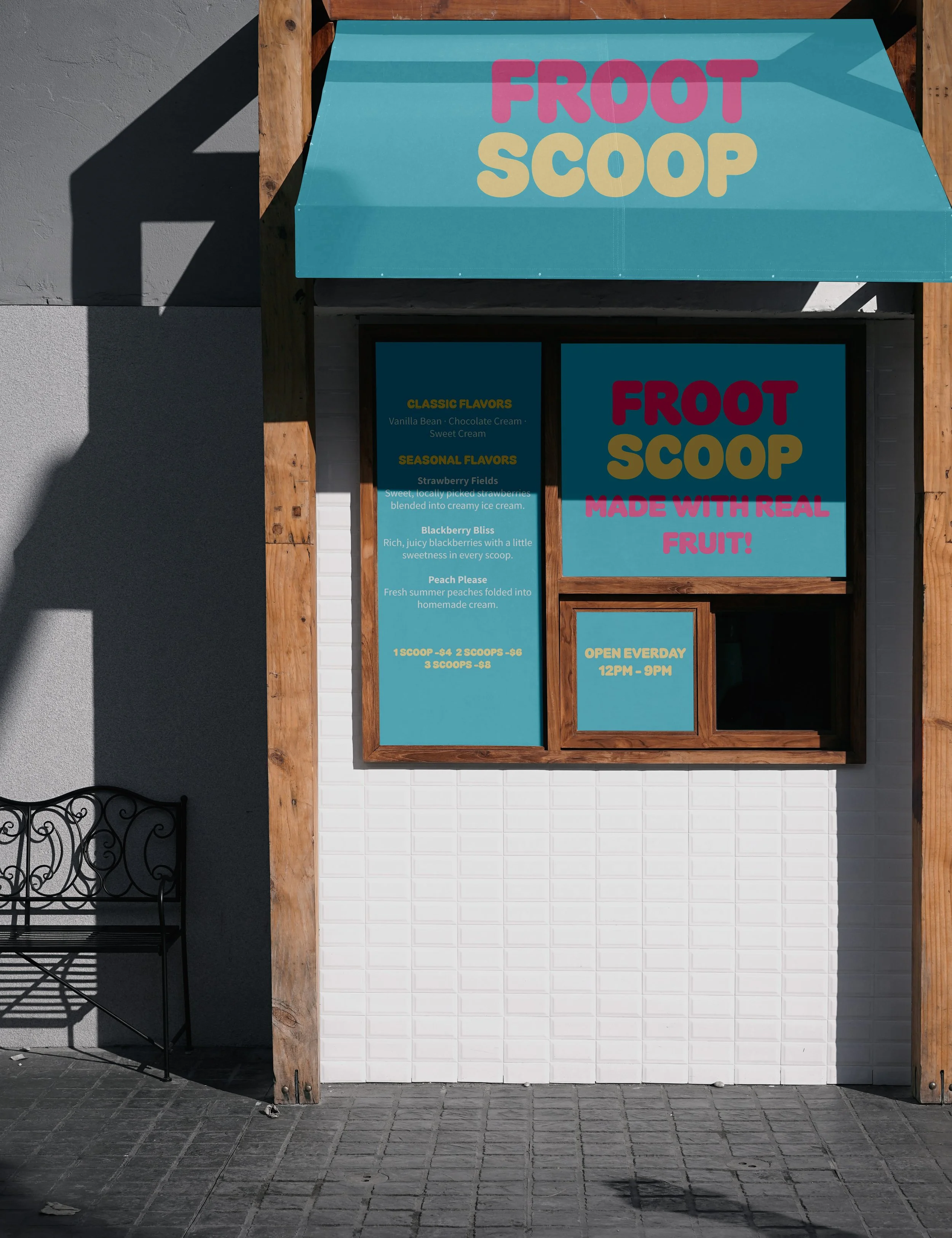
In June it’s strawberry. In August it’s blackberry. When the fruit’s gone, so is the flavor.
We work along side with local farms to turn whatever’s ripe into the next scoop. Fresh fruit, real ice cream.
This is aimed toward families, teenagers and young kids.
Logo Overview
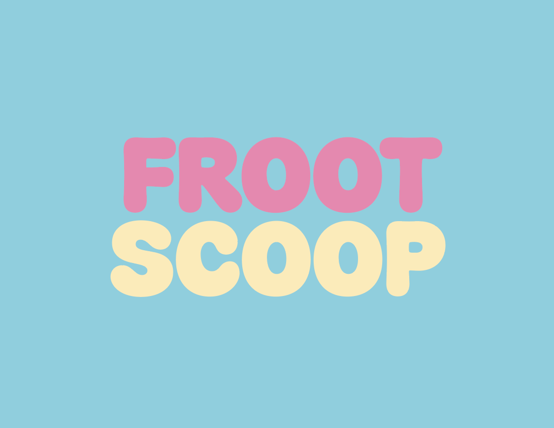
The bubbly, inflated type gives it a nostalgic ice cream shop feel without being too dated.
Alternative Logo

In most instances, the previous logo will be used but this is a more shortened version of it. This might be used for certain mediums like social media. The same typeface and color palette will be used.
Color Palette
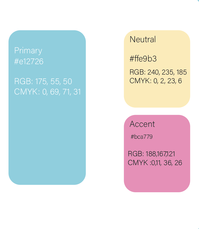
What makes this ice cream so special is the fact that it follows the harvests from farmer’s markets. When developing my color pallette I really wanted to put enphasis on the farmer’s market aespect while also apealing to it being a place that sells ice cream. The blue is the primary color due to it being inspiration from old U.S ice cream parlors and it gives off that warm and nostalgic feel.
Accent
The pink is to pay homage to those neon signs from the 19050’s, while being a bright, juicy color of fresh fruit.
Neutral
Brings a warm contrast from the pink.
Deliverables