

About
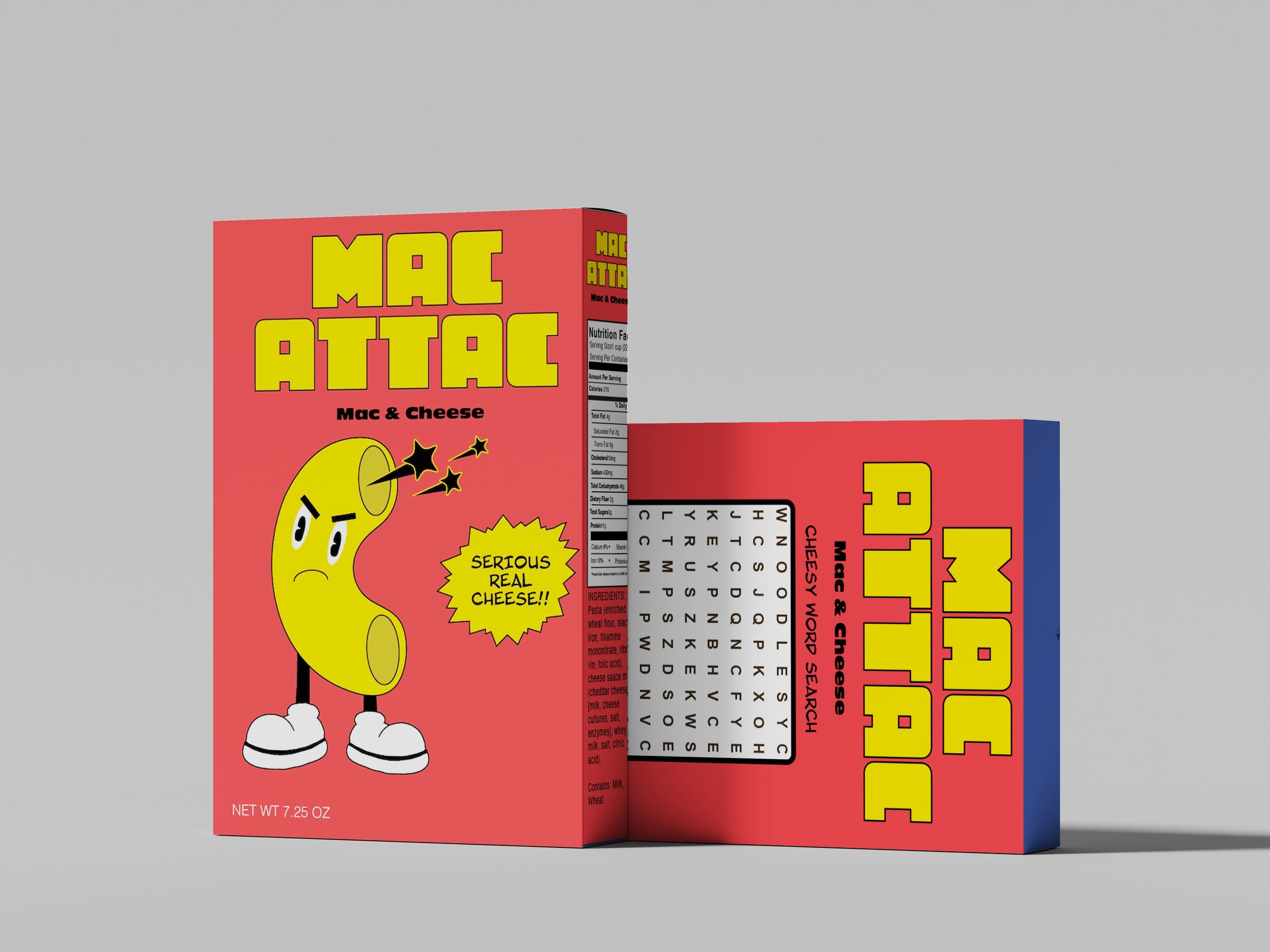
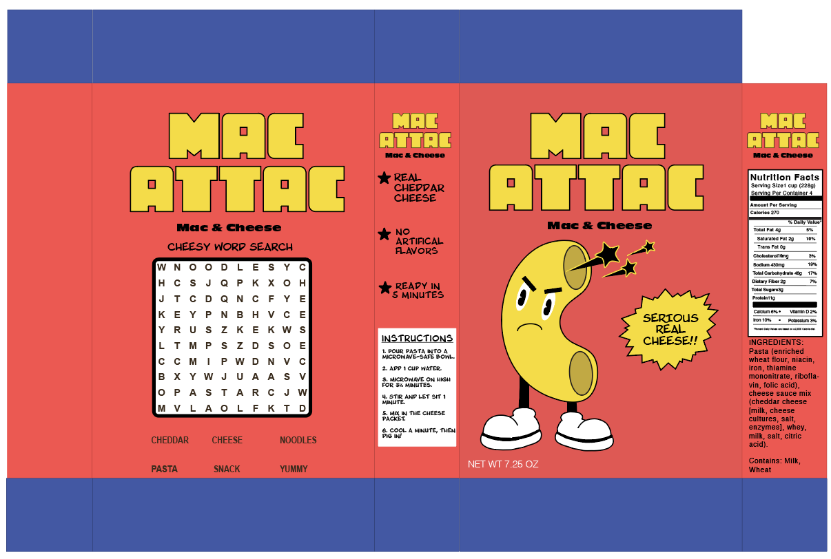
“Mac Attac” is mac and cheese brand that uses real cheddar and no artificial flavors, so parents can feel good about what’s in the bowl. It’s ready in five minutes, and there’s a word search on every box to keeps kids busy while they wait.
Early Concept
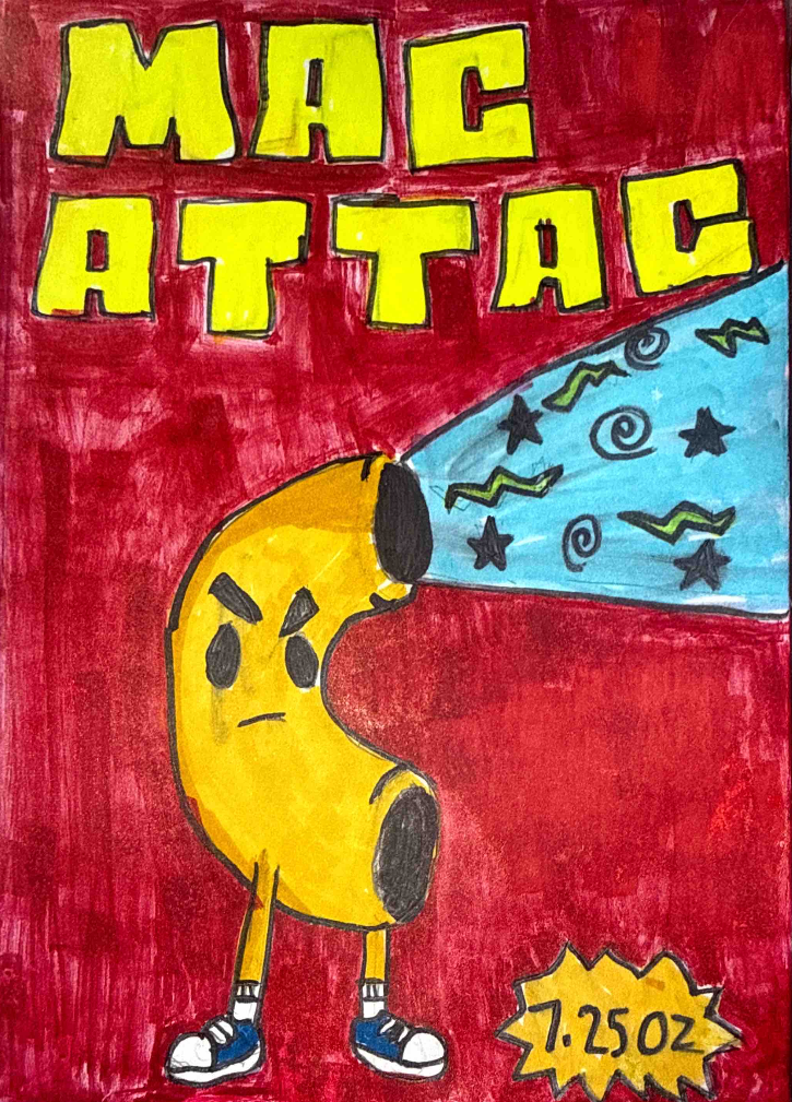
I started by drawing the character first because I wanted something kid-friendly and fun. Once I had the character I landed on the design.
Logo Overview
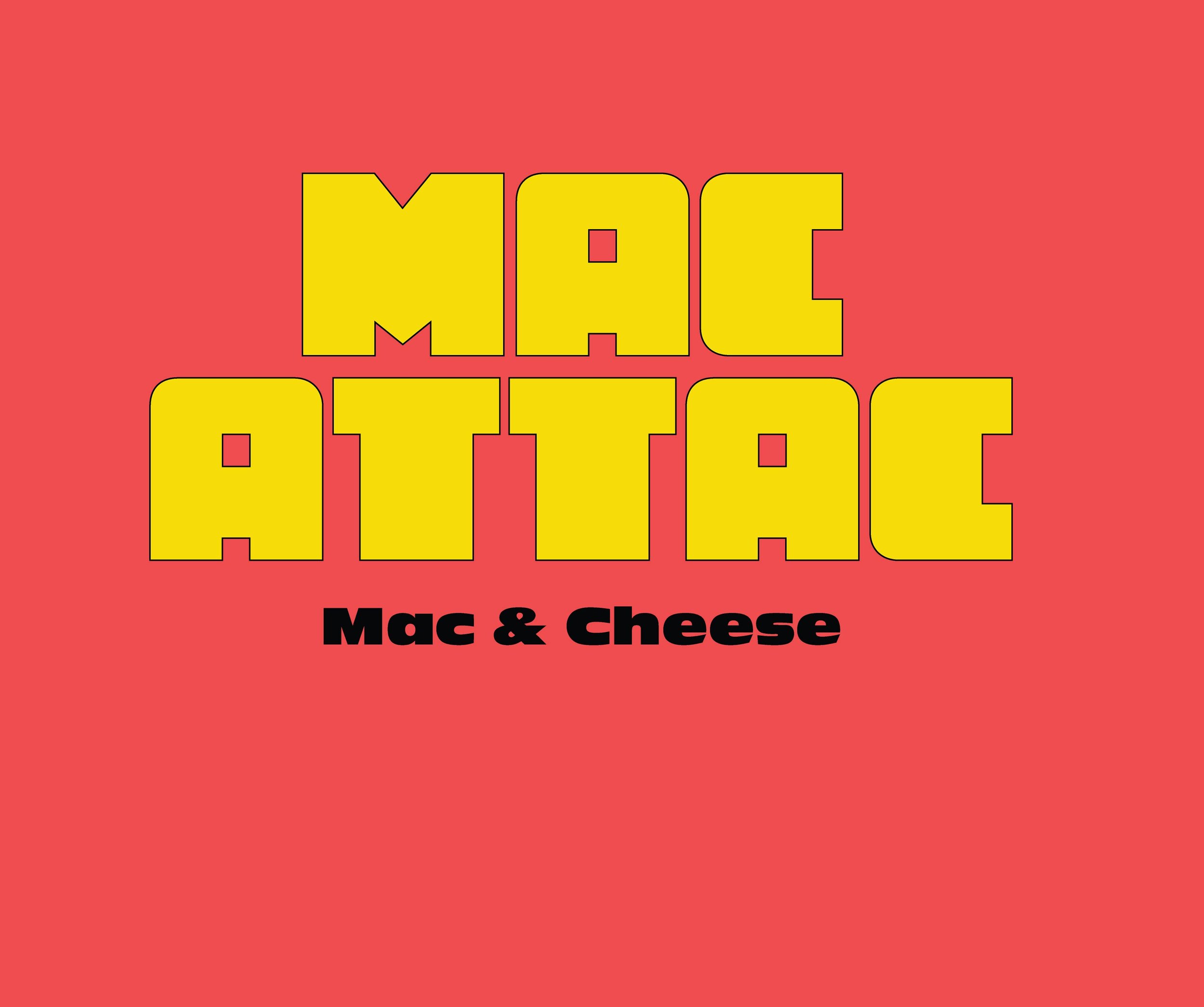
The name and typeface was inspired by the video game Pac-Man and for color I wanted to move away from the stereotypical blue boxes that dominate the grocery store shelves. I wanted this design to be bold, energetic, and playful.
Color Palette
Primary
Red is used as a bold contrast against the yellow.
Accent
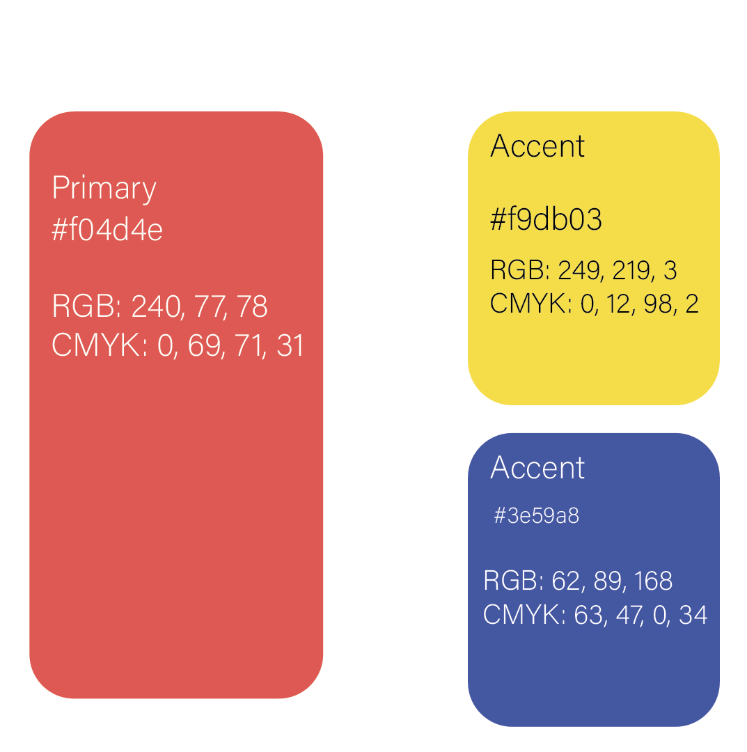
The bright yellow is to connect with “mac and cheese” and the blue to give the mascot a super hero feel.
Social Media
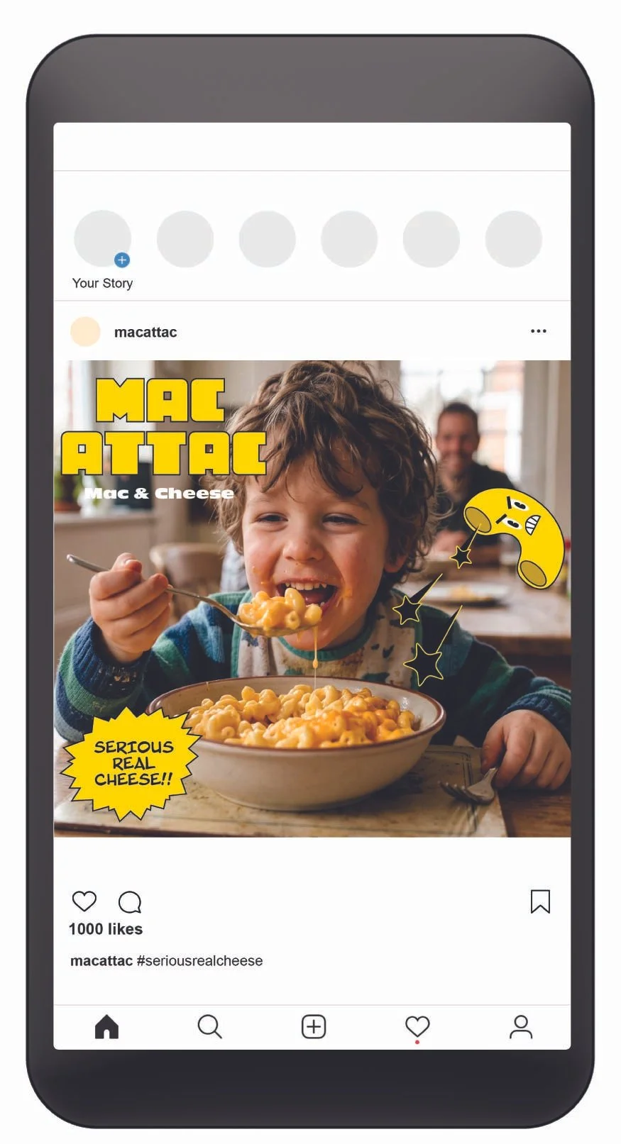
Using a realistic image with my mascot is to show how fun the product is in an “everyday setting”. The goal was to make the product more than just a box of pasta but a brand with its own personality.
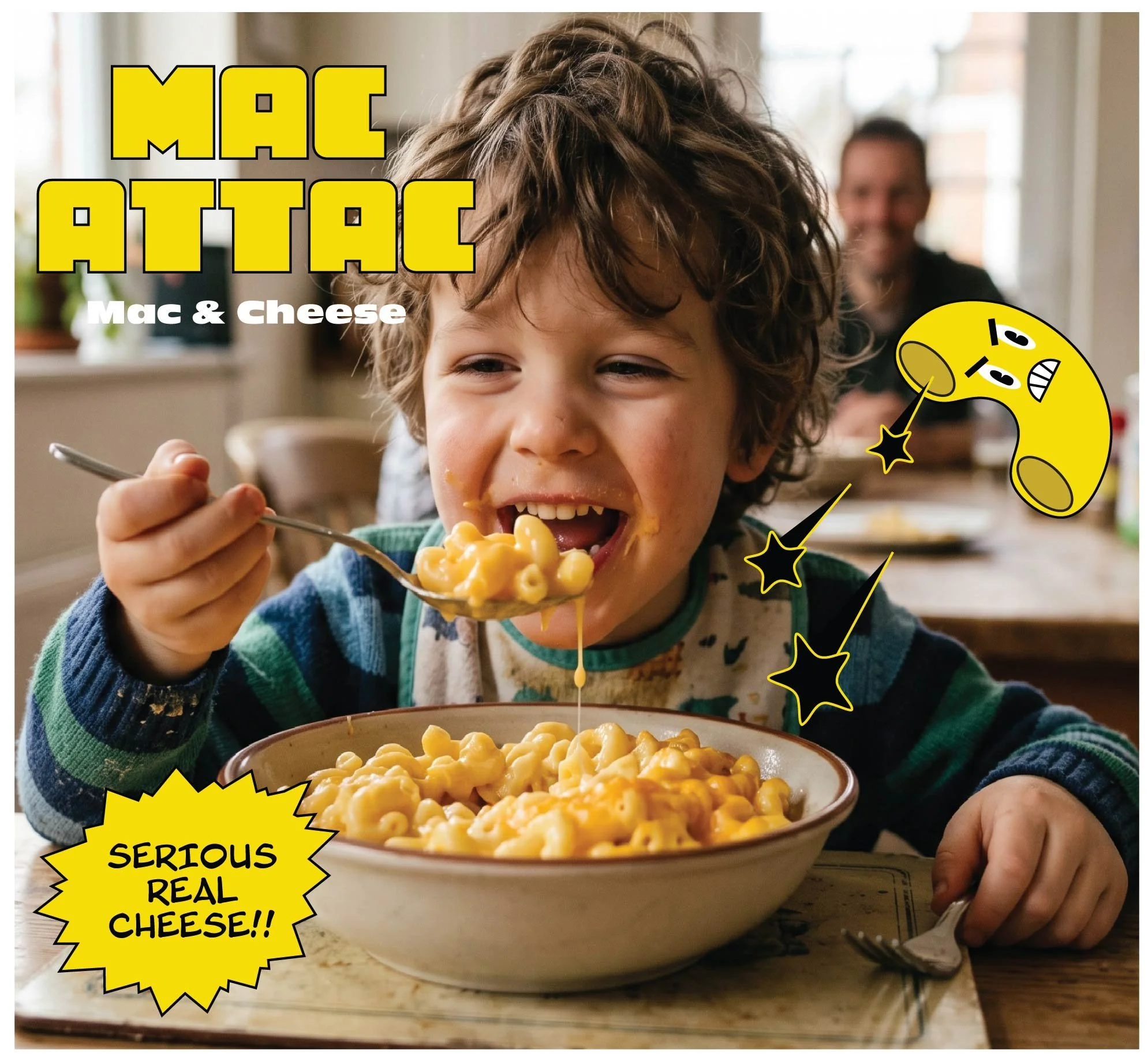
Meet “Angry Mac”

Angry Mac gives personality to a typical box of mac and cheese. His angry expression helps make the brand be recognizable, fun for younger audiences, and coexist with the title “Mac Attac”.